Optimising process and data access for Smartology's ad campaign management dashboard
Overview
The project was driven by changes in the advertising industry moving towards automated online (programmatic) advertising. There was also more focus on data-driven campaign optimisation, which meant the need to improve the company's internal workflows to adapt to these changes.
Objectives
- Develop a new dashboard interface within 8 months
- Optimise processes for adopting programmatic advertising technologies
- Streamline data access
Team
- Natalie H. Man, UX Designer, Smartology
- Robert Varney, Senior UX Designer, Freelance (support for high fidelity prototyping and testing)
Key learnings
As the solo designer, this project taught me valuable lessons on how to effectively apply the UX process. It also emphasised the importance of adapting quickly to my team's needs over strictly following a linear design process.
When the new dashboard design was launched, I noticed how the UX process improved team collaboration. For example, the engineering team proactively asked the team for feedback and did more user testing on features they were developing. I feel that I would have more clarity if I knew how to question the 'whys' about the business objectives. For example, why was the dashboard missing key data for account managers to do their reporting? Why was sales and finance capturing certain data, which is not be stored on the current dashboard?
This project taught me to embrace flexibility and adapt to unpredictable changes whilst maintaining clarity on the project's direction.
Process
Gathering insights through collaborative voting
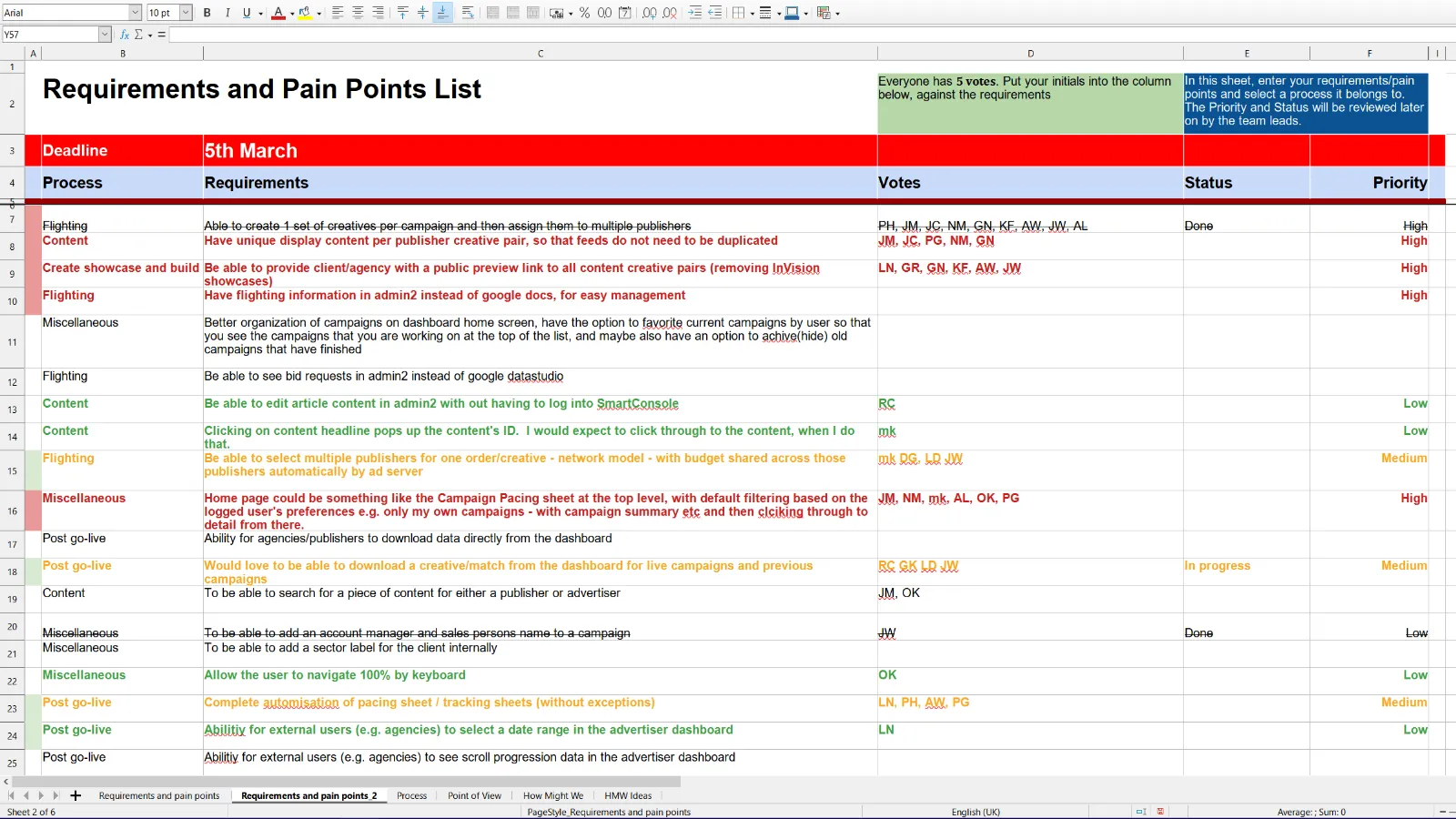
I allocated around 3 weeks for user research and the first activity was to gather requirements and pain points from the team. My goal was to ensure transparency and have all relevant team members be involved in the process. Also, since my team had no UX maturity, it was a good opportunity to introduce activities that encourages them to work collaboratively and receive updated on the project's progress.
Prioritising automation and centralised data capture for optimised team workflow
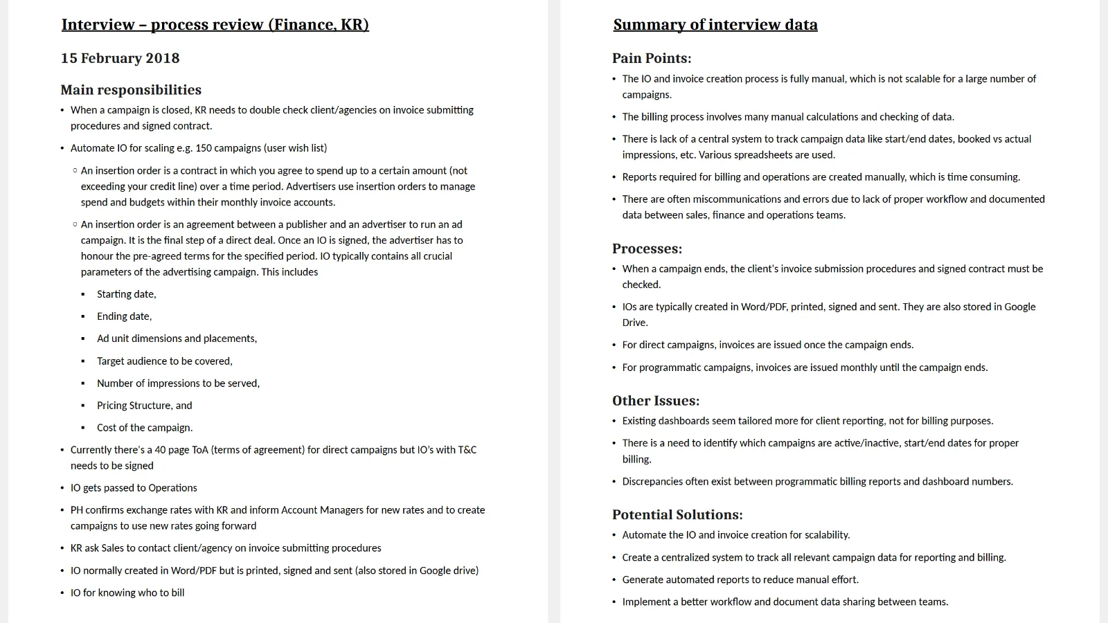
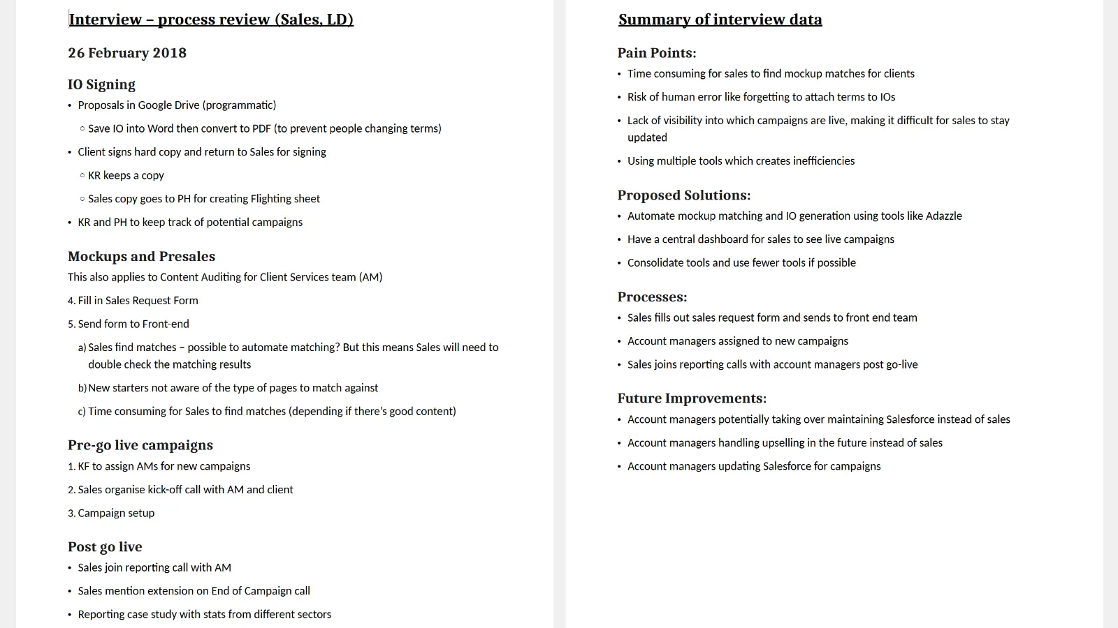
The existing dashboard's development was mostly focused on supporting the account management team. However, speaking to secondary users like finance and sales highlighted how their pain points in their workflows and dashboard usage are generally overlooked by the primary users (account management). The insights gained from the interviews presented opportunities in improving other areas of the dashboard.
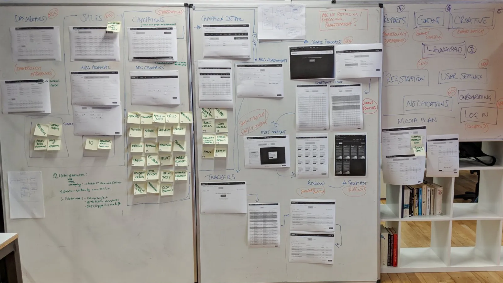
Workflow optimisation through flow diagrams
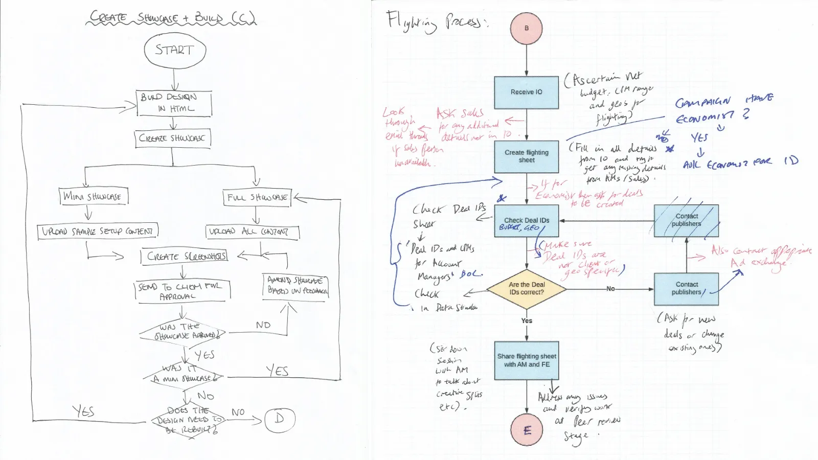
I sketched multiple flow diagrams to visualise the different workflows for teams like sales and finance. They were recreated in Lucid Chart and printed for relevant stakeholders to review, ensuring the diagrams accurately reflected their processes. Their feedback helped identify missing information between the current processes and what the dashboard captured. This highlighted opportunities to include more data fields in the dashboard for storing important client campaign information, rather than saving numerous files in Google Drive.
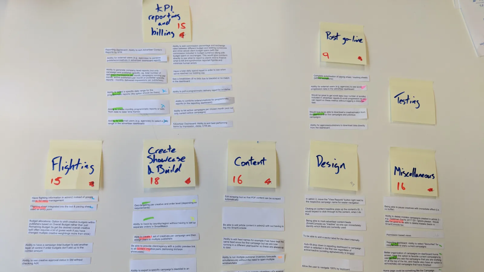
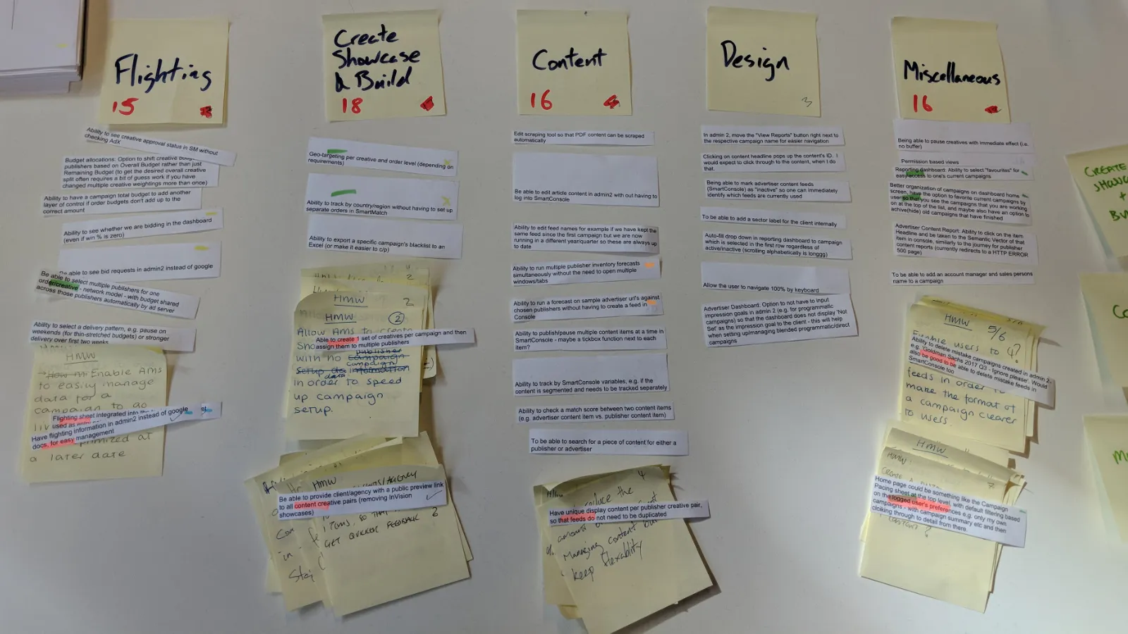
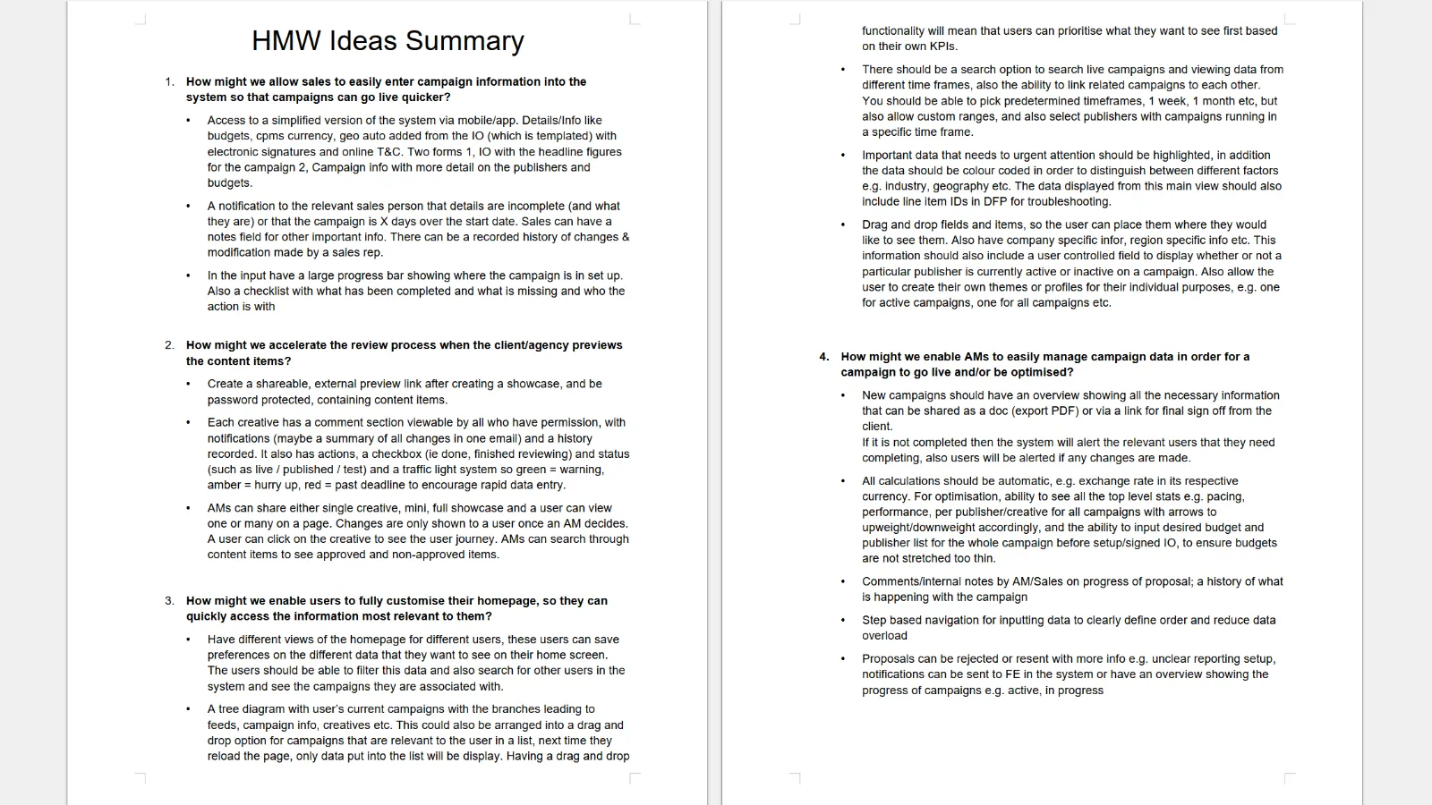
Facilitating creative brainwriting in stakeholder ideation workshops
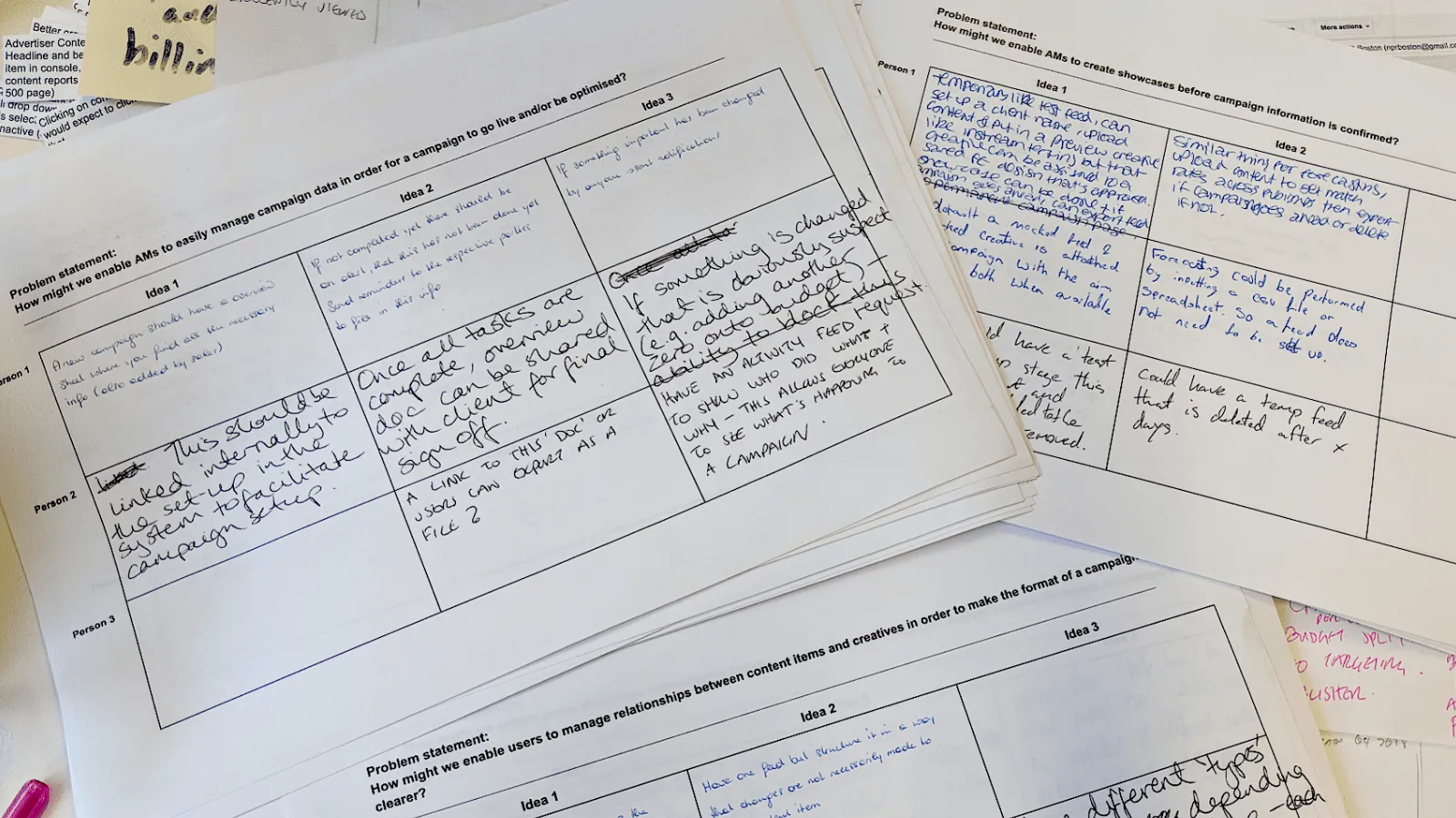
For the ideation workshops, I combined HMWs and brainwriting into a structured activity. My team are also not use to collaborative activities, so I approached it this way to ensure everyone can participate without feeling overwhelmed. I wanted all participants to equally contribute independently without the stress of being judged by others. This not only provides diverse ideas but having them write on paper helps them to focus on the topic and their thoughts with little distractions.
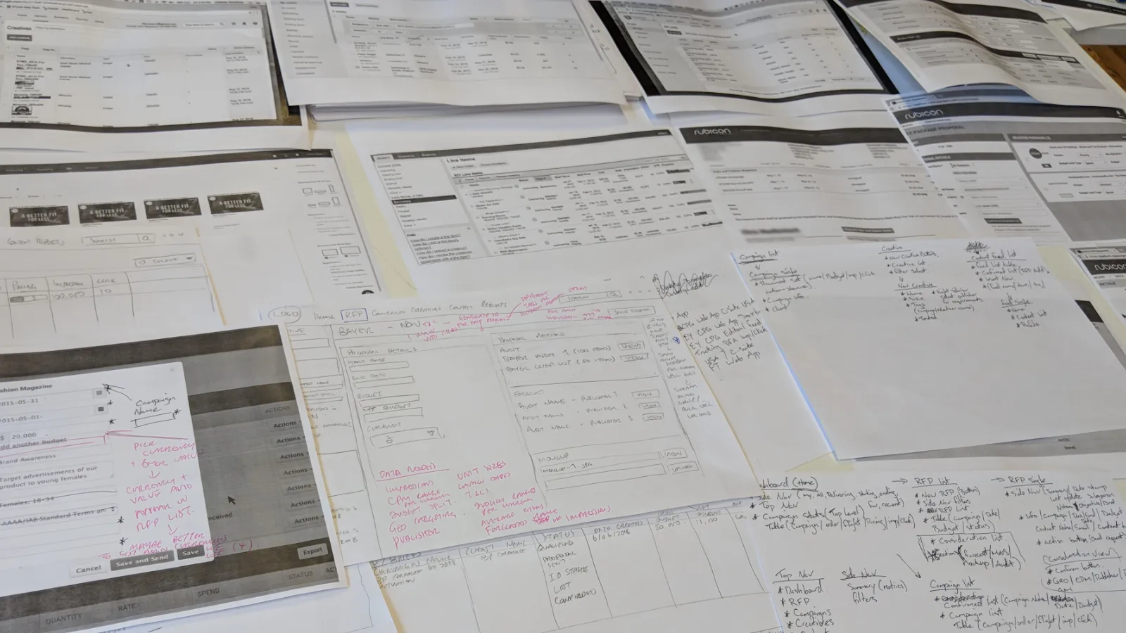
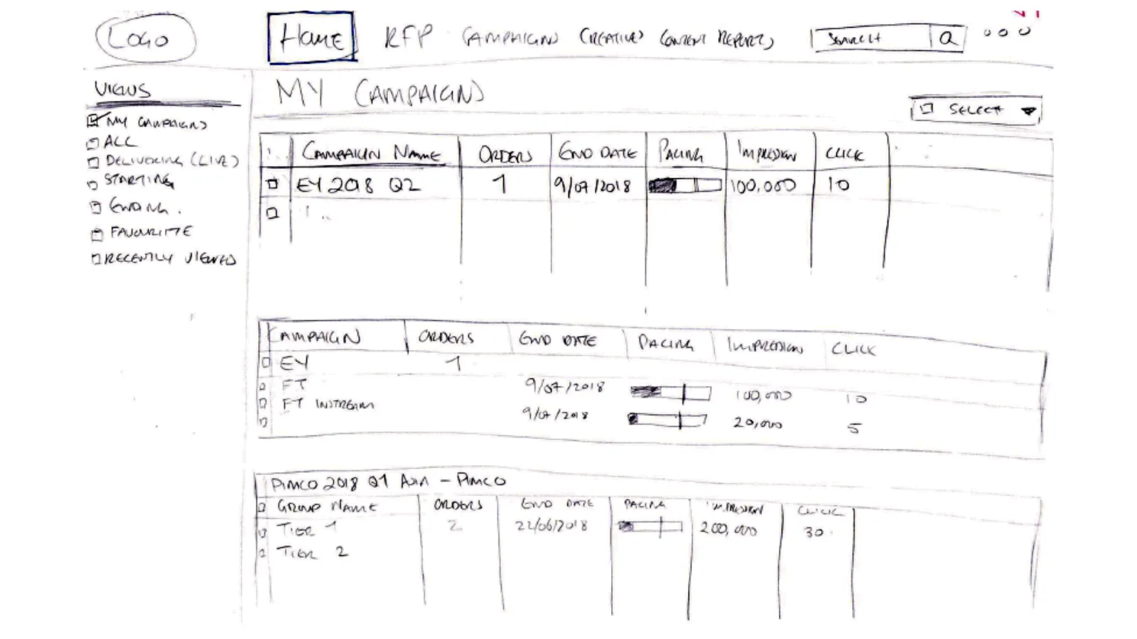
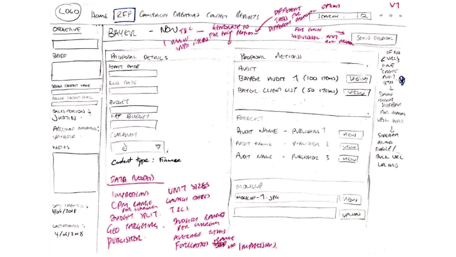
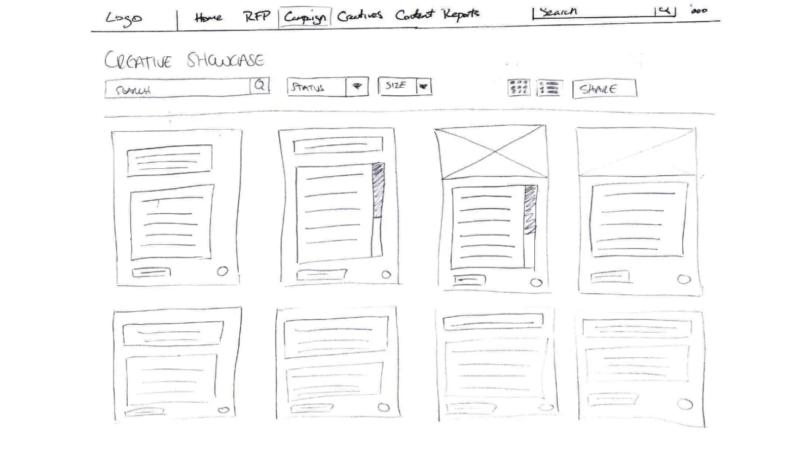
Wireframing concepts from competitor dashboard analysis
I analysed various competitors' dashboards to understand how they organise content for users to find data efficiently. Based on the insights, I created various wireframes and had stakeholders provide feedback such as suggestions on having an RFP (request for proposal) section for managing the sales pipeline. This activity highlighted the importance of reviewing competitors to validate design assumptions and learn best practices addressing similar challenges.
Guiding development through user testing
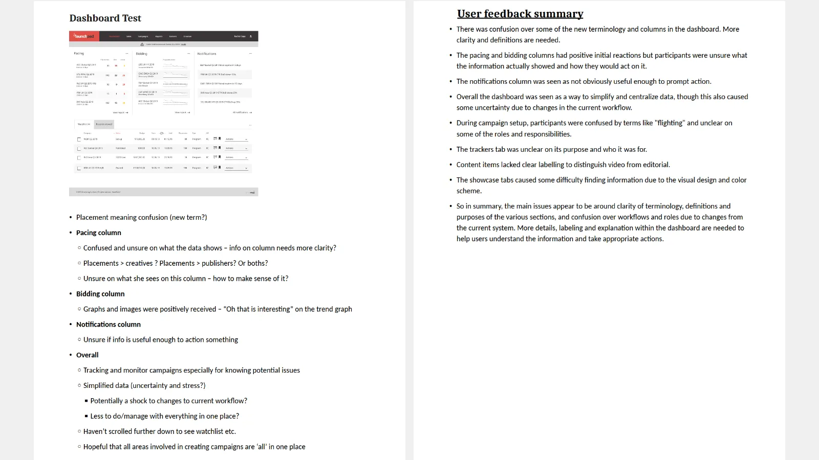
With the development team preparing for sprint planning and development, we hired a contract senior ux designer to prototype a full campaign management dashboard. My collaboration with the designer involved providing context on our campaign management processes and how we used the existing dashboard. I also shared insights and challenges from user research and presented flow diagrams to help him visually see the flow of the system.
Some areas of the process had insufficient research data, so we leveraged existing data to prototype the key areas used regularly by the team in high fidelity. We also mapped a user flow to visualise navigation through the prototype, and did user testing using Invision and Silverback to gather feedback.
Outcome
Admin 2.0: an iterative process to dashboard refinement
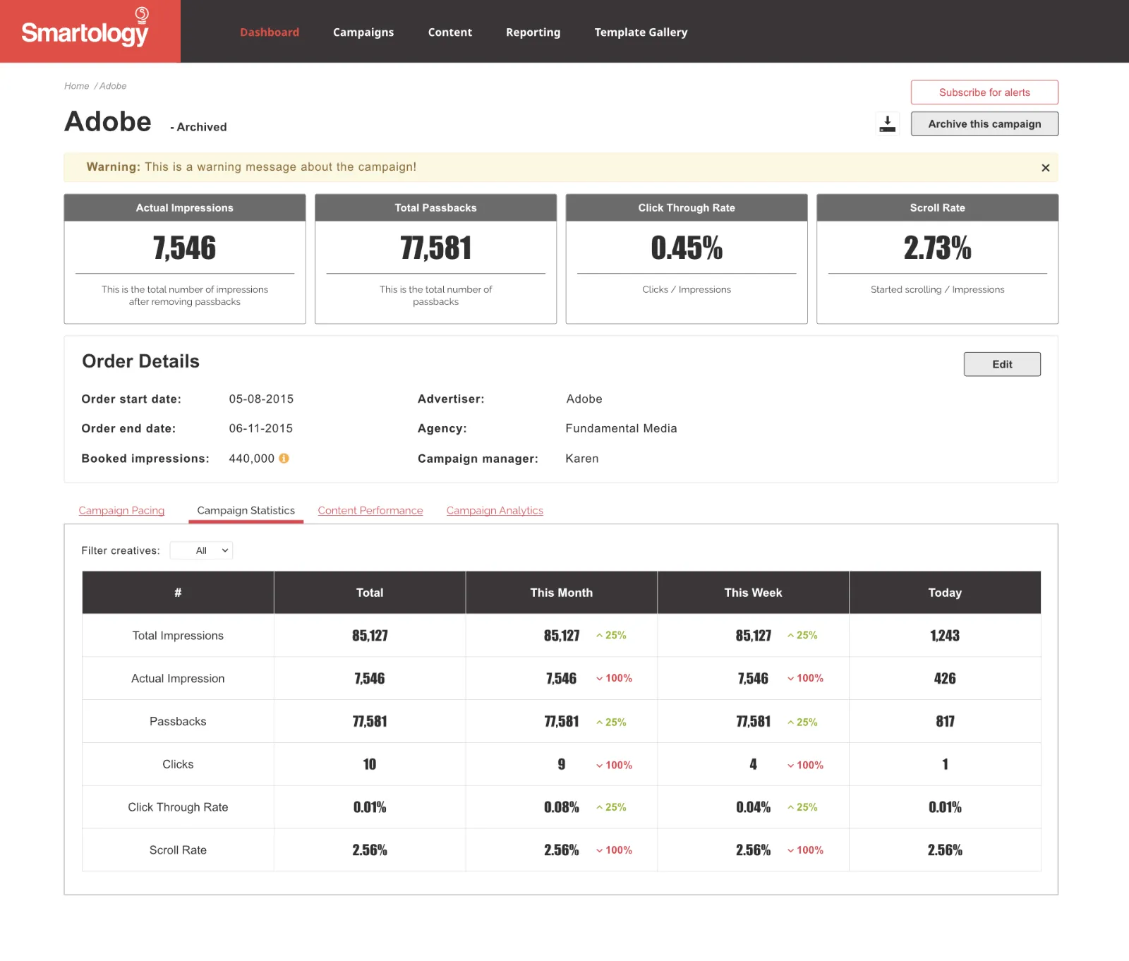
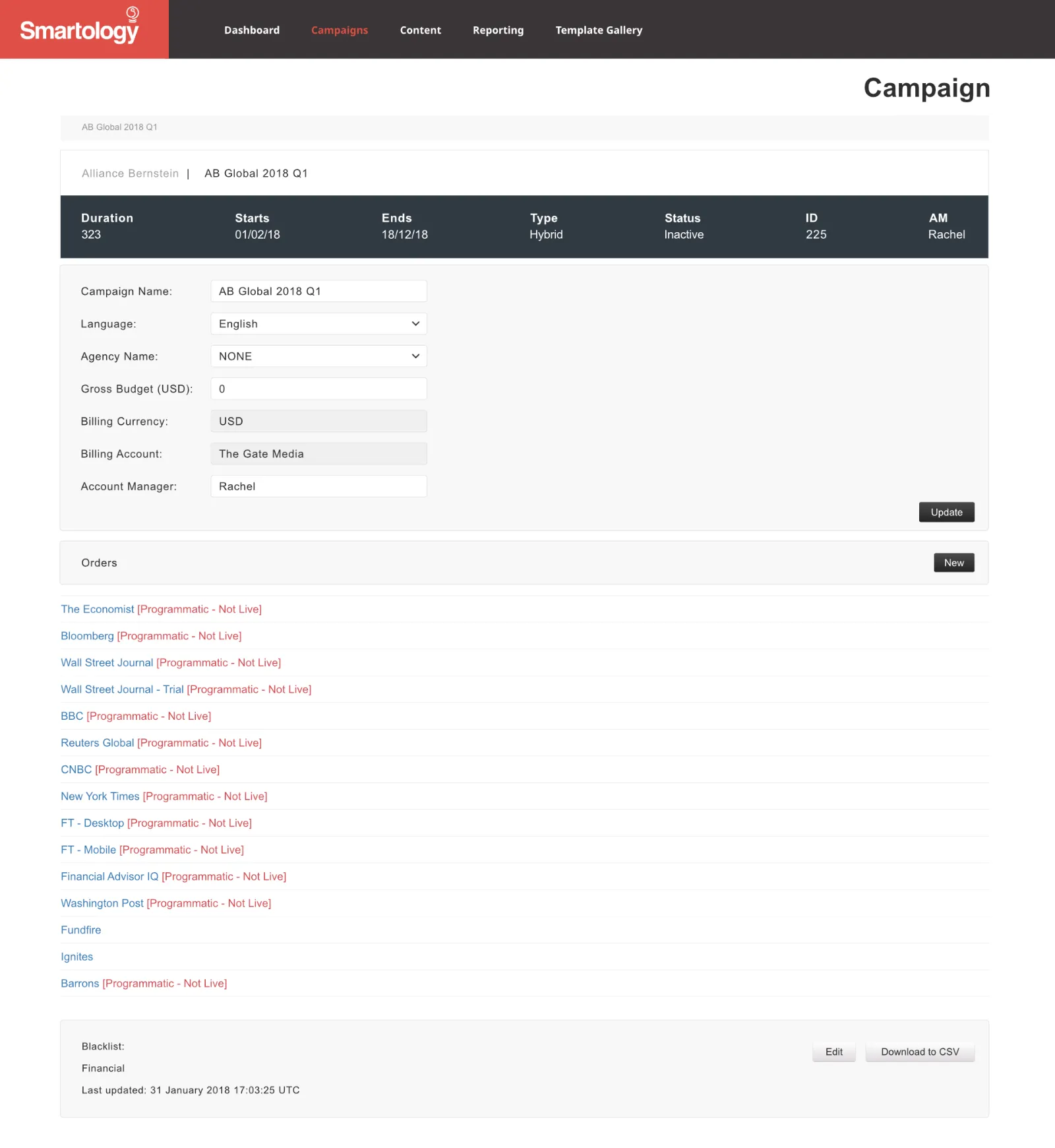
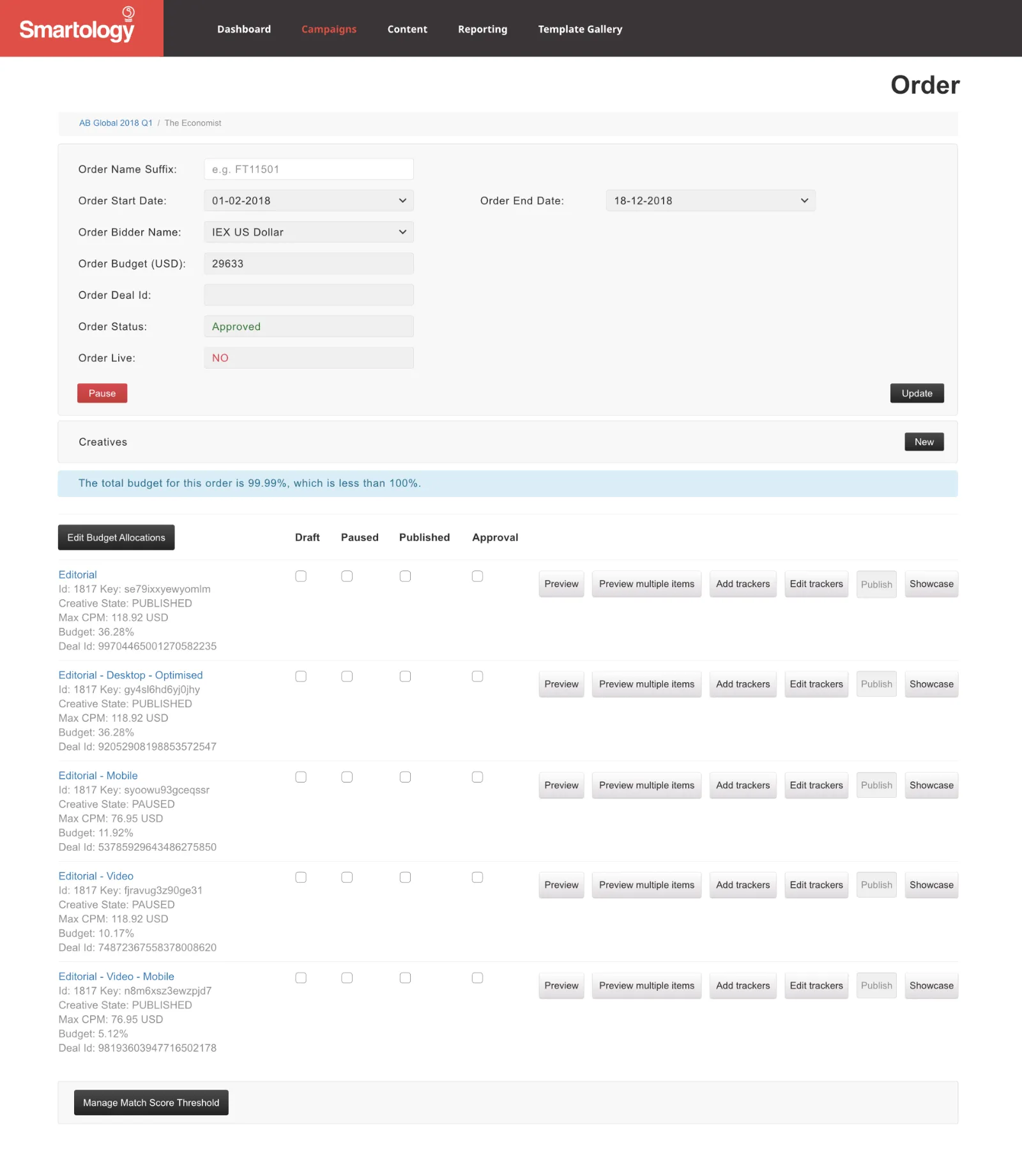
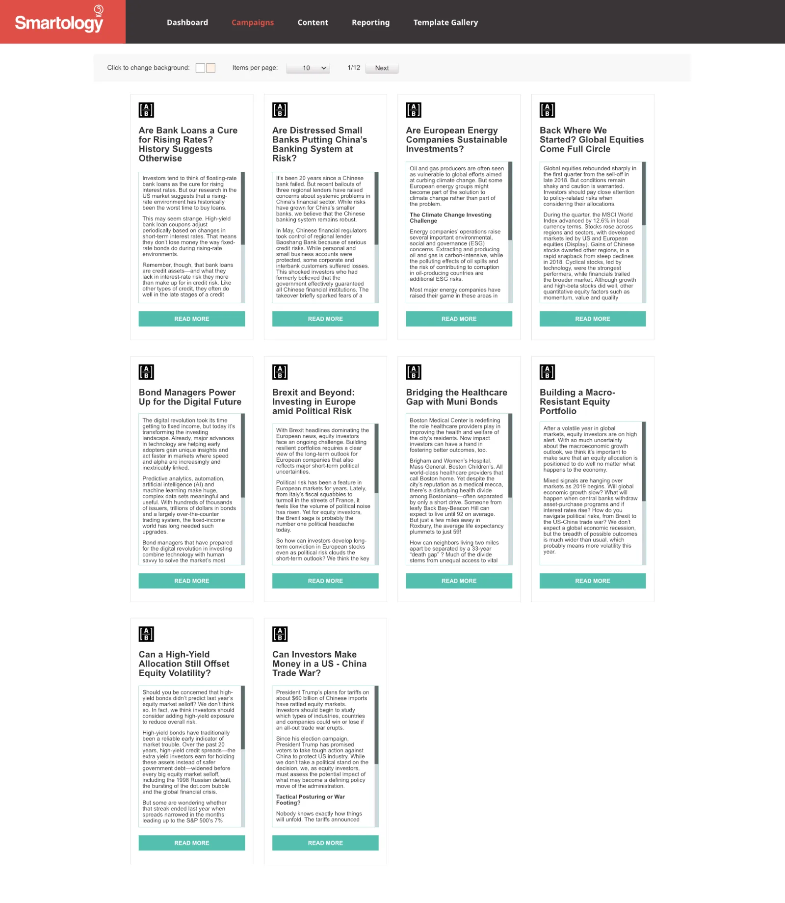
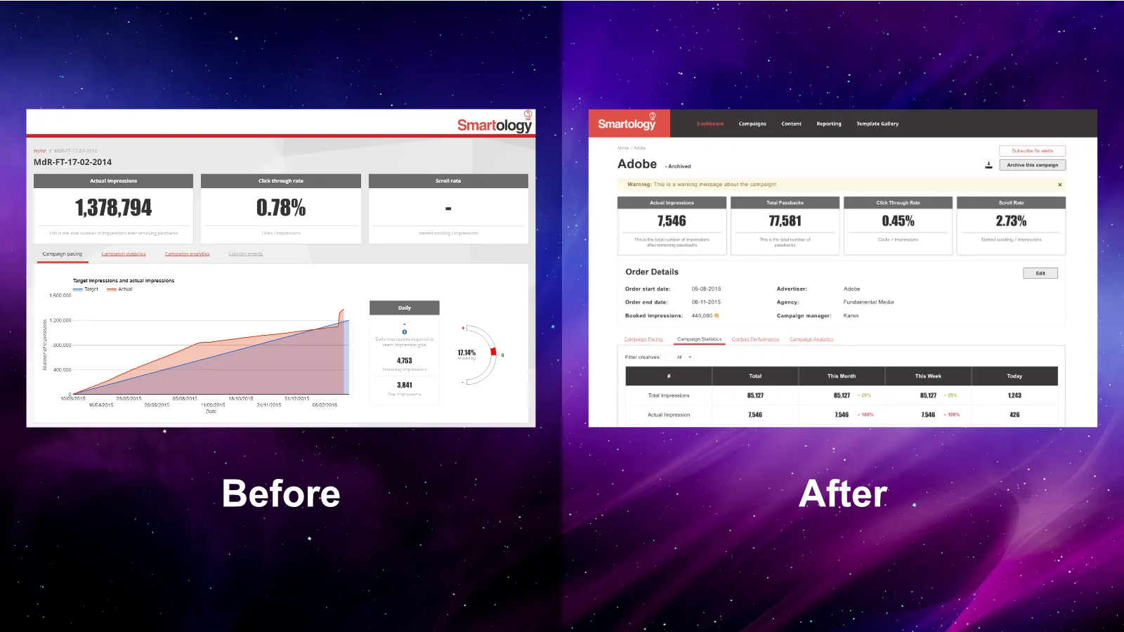
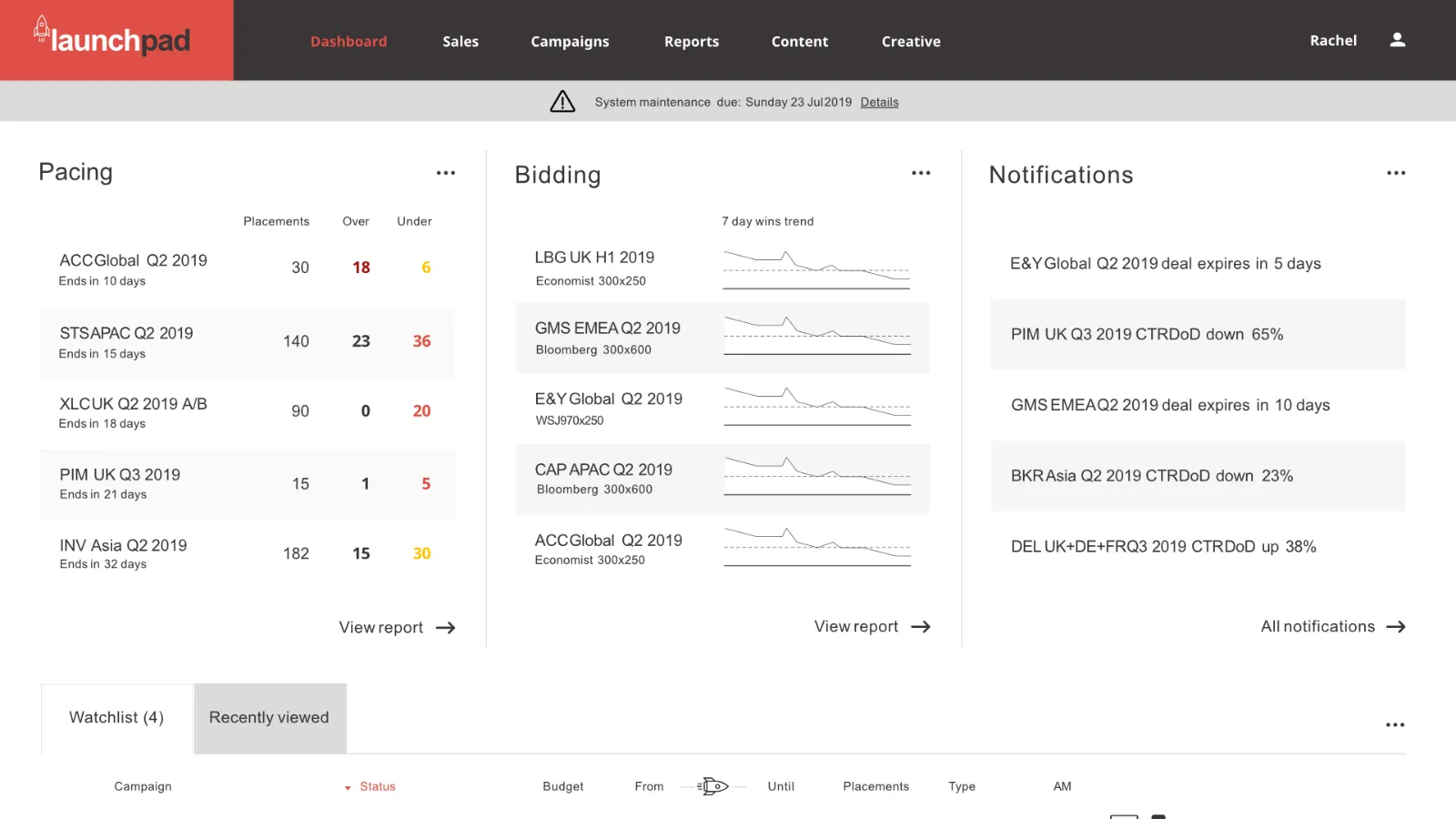
The initial dashboard release supported the early adoption of programmatic advertising, allowing our company to offer this emerging technology as a new service. Key features such as data exporting and creative gallery preview improved account managers' workflow. Clear labeling and presentation of key data also enhanced transparency for campaign management. The automated workflow provided by programmatic advertising helped scale our business efficiently, increasing both client numbers and campaign capacity.
Working with unpredictable markets and needs taught me the importance of organic, iterative growth as requirements evolve over time. Focusing initial development on core functionality provided a stable foundation while additional features were gradually implemented. As a designer on such a project, flexibility and adaptability were key to collaborate effectively through this dynamic, user-centered design process.
The images below are screens of the new dashboard using some design elements from the prototype such as the navigation menu and colour scheme.